TabRow
| Material | Material 3 |
|---|---|
 |  |
Los TabRow en Jetpack Compose, un TabRow es un contenedor que mantiene una fila de pestañas.
se puede personalizar para cambiar el color de fondo, el color del contenido, el indicador de la pestaña seleccionada y la separación entre las pestañas.
Implementación
Definición del componente
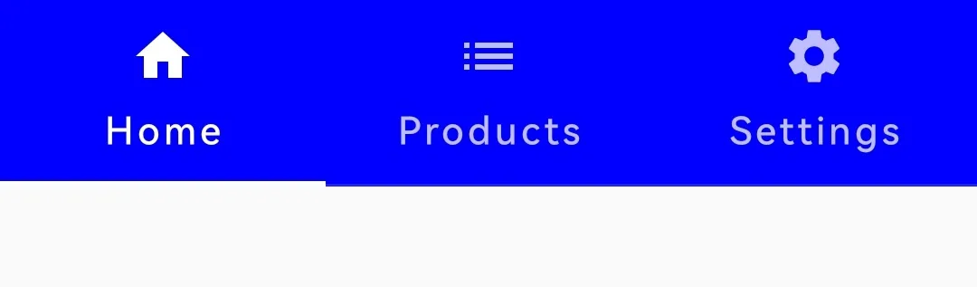
@Composablefun TabRow( selectedTabIndex = tabIndex, modifier = Modifier, backgroundColor = Color.Blue, indicator = {}, divider = {}, contentColor= Color.White ){}| Atributo | Descripción |
|---|---|
| selectedTabIndex | Índice de la pestaña seleccionada actualmente. |
| modifier | Modificador que implementará el composable. |
| backgroundColor | Color de fondo del TabRow. |
| indicator | Función lambda que define el indicador que resalta la pestaña seleccionada. |
| contentColor | Color del contenido. |
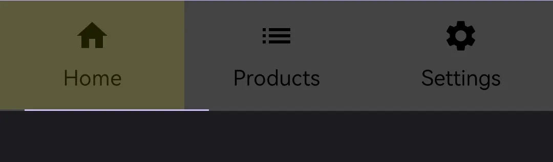
@Composablefun TabRow( selectedTabIndex = tabIndex, modifier = Modifier, containerColor = Color.DarkGray, contentColor = Color.Yellow, indicator = {}, divider = {} ){}| Atributo | Descripción |
|---|---|
| selectedTabIndex | Índice de la pestaña seleccionada actualmente. |
| modifier | Modificador que implementará el composable. |
| containerColor | Color de fondo del TabRow. |
| indicator | Función lambda que define el indicador que resalta la pestaña seleccionada. |
| contentColor | Color de fondo al dar click en una pestaña. |
| divider | Función lambda que se utiliza para establecer el divisor entre las pestañas. Si no se especifica, se utiliza un divisor predeterminado. |
Ejemplos
@Composablefun MyTabScreen() {
    var tabIndex by remember { mutableIntStateOf(0) }    val tabs = listOf("Home", "Products", "Settings")
    Column(modifier = Modifier.fillMaxWidth()) {        TabRow(            selectedTabIndex = tabIndex,            modifier = Modifier,            backgroundColor = Color.Blue,            contentColor = Color.White,            indicator = { tabPositions ->                TabRowDefaults.apply {                Divider(Modifier                        .height(2.dp)                        .padding(horizontal = 16.dp)                        .tabIndicatorOffset(tabPositions[tabIndex]),                        color = MaterialTheme.colors.primary                    )                }            },            divider ={}        ) {            tabs.forEachIndexed { index, title ->                Tab(text = { Text(title) },                    selected = tabIndex == index,                    onClick = { tabIndex = index },                    icon = {                        when (index) {                            0 -> Icon(imageVector = Icons.Default.Home, contentDescription = null)                            1 -> Icon(imageVector = Icons.Default.List, contentDescription = null)                            2 -> Icon(imageVector = Icons.Default.Settings, contentDescription = null)                        }                    }                )            }        }
        when (tabIndex) {            0 -> HomeScreen()            1 -> ProductsScreen()            2 -> SettingsScreen()        }    }}
@Composablefun HomeScreen() {    Column(        Modifier.fillMaxSize(),        verticalArrangement = Arrangement.Center,        horizontalAlignment = Alignment.CenterHorizontally    ) {        Text(text = "Home", fontSize = 25.sp)    }}
@Composablefun ProductsScreen() {    Column(        Modifier.fillMaxSize(),        verticalArrangement = Arrangement.Center,        horizontalAlignment = Alignment.CenterHorizontally    ) {        Text(text = "Products", fontSize = 25.sp)    }}
@Composablefun SettingsScreen() { Column( Modifier.fillMaxSize(), verticalArrangement = Arrangement.Center, horizontalAlignment = Alignment.CenterHorizontally ) { Text(text = "Settings", fontSize = 25.sp) }}@Composablefun MyTabScreen() {
var tabIndex by remember { mutableIntStateOf(0) } val tabs = listOf("Home", "Products", "Settings")
Column(modifier = Modifier.fillMaxWidth()) { TabRow( selectedTabIndex = tabIndex, modifier = Modifier, containerColor = Color.DarkGray, contentColor = Color.Yellow, indicator = { tabPositions -> TabRowDefaults.apply { Divider(Modifier .height(2.dp) .padding(horizontal = 16.dp) .tabIndicatorOffset(tabPositions[tabIndex]), color = MaterialTheme.colorScheme.primary ) } }, divider ={} ) { tabs.forEachIndexed { index, title -> Tab(text = { Text(title) }, selected = tabIndex == index, onClick = { tabIndex = index }, icon = { when (index) { 0 -> Icon(imageVector = Icons.Default.Home, contentDescription = null) 1 -> Icon(imageVector = Icons.Default.List, contentDescription = null) 2 -> Icon(imageVector = Icons.Default.Settings,contentDescription = null) } } ) } }
when (tabIndex) { 0 -> HomeScreen() 1 -> ProductsScreen() 2 -> SettingsScreen() } }}
@Composablefun HomeScreen() { Column( Modifier.fillMaxSize(), verticalArrangement = Arrangement.Center, horizontalAlignment = Alignment.CenterHorizontally ) { Text(text = "Home", fontSize = 25.sp) }}
@Composablefun ProductsScreen() { Column( Modifier.fillMaxSize(), verticalArrangement = Arrangement.Center, horizontalAlignment = Alignment.CenterHorizontally ) { Text(text = "Products", fontSize = 25.sp) }}
@Composablefun SettingsScreen() { Column( Modifier.fillMaxSize(), verticalArrangement = Arrangement.Center, horizontalAlignment = Alignment.CenterHorizontally ) { Text(text = "Settings", fontSize = 25.sp) }}