TextField
| Material | Material 3 |
|---|---|
 |  |
Los TextField permiten a los usuarios introducir texto a la UI. Suelen aparecer en formularios y cuadros de diálogo.
Estos tienen dos variaciones:
FilledTextFieldOutlinedTextField
Por defecto, los TextField siempre son del tipo FilledTextField.
Implementación
Definición del componente
@Composablefun TextField( value: String, onValueChange: (String) -> Unit, modifier: Modifier = Modifier, enabled: Boolean = true, readOnly: Boolean = false, textStyle: TextStyle = LocalTextStyle.current, label: (@Composable () -> Unit)? = null, placeholder: (@Composable () -> Unit)? = null, leadingIcon: (@Composable () -> Unit)? = null, trailingIcon: (@Composable () -> Unit)? = null, isError: Boolean = false, visualTransformation: VisualTransformation = VisualTransformation.None, keyboardOptions: KeyboardOptions = KeyboardOptions.Default, keyboardActions: KeyboardActions = KeyboardActions(), singleLine: Boolean = false, maxLines: Int = if (singleLine) 1 else Int.MAX_VALUE, minLines: Int = 1, interactionSource: MutableInteractionSource? = null, shape: Shape = TextFieldDefaults.TextFieldShape, colors: TextFieldColors = TextFieldDefaults.textFieldColors()): Unit| Atributo | Descripción |
|---|---|
| value | El texto que se mostrará en el campo de texto |
| onValueChange | La devolución de llamada que se activa cuando se actualiza el texto, pasando el mismo texto actualizado por parámetro |
| modifier | El modificador de este campo |
| enabled | Permite habilitar o deshabilitar el campo. Cuando es false el campo no se puede ni editar, ni hacer focus, ni copiar su texto |
| readOnly | Controla si el campo es editable o no. Cuando es true, el campo no se puede editar, pero si se puede hacer focus y copiar su texto |
| textStyle | El estilo que se aplicará al texto: color, tamaño, fondo, etc. |
| label | Etiqueta opcional que se muestra dentro del campo de texto |
| placeholder | Texto provisional que se muestra cuando el campo de texto está seleccionado y su contenido está vacío |
| leadingIcon | Imagen opcional que se muestra al inicio del contenedor del campo de texto |
| trailingIcon | Imagen opcional que se muestra al final del contenedor del campo de texto |
| isError | Indica si el valor del campo de texto está mal o no. Cuando es true pinta de rojo algunas partes del contenedor |
| visualTransformation | Transforma la representación visual del texto. Se suele usar en campos de tipo contraseña para ocultar el texto |
| keyboardOptions | Especifica el tipo de texto a escribir o tipo de teclado a mostrar, phone, email, number, etc. También se utiliza para otras funciones |
| keyboardActions | Se utiliza para definir la acción y ejecutar cuando se presione enter en el teclado. En este caso es una búsqueda |
| singleLine | Indica si el texto debe ocupar una sola línea. Cuando es true, el campo de texto se convierte en un campo con scroll horizontal en vez de ajustarse a varias líneas |
| maxLines | Indica el número máximo de líneas de texto visibles |
| minLines | Indica el número mínimo de líneas de texto visibles |
| interactionSource | Sirve para permitir agregar interacciones nuevas al flujo y para controlar las interacciones del usuario |
| shape | Define la forma del contenedor del campo de texto |
| colors | Colores usados para pintar el los elementos del campo de texto (text, label, placeholder, leadingIcon, trailingIcon, etc.) |
@Composablefun TextField( value: String, onValueChange: (String) -> Unit, modifier: Modifier = Modifier, enabled: Boolean = true, readOnly: Boolean = false, textStyle: TextStyle = LocalTextStyle.current, label: (@Composable () -> Unit)? = null, placeholder: (@Composable () -> Unit)? = null, leadingIcon: (@Composable () -> Unit)? = null, trailingIcon: (@Composable () -> Unit)? = null, prefix: (@Composable () -> Unit)? = null, suffix: (@Composable () -> Unit)? = null, supportingText: (@Composable () -> Unit)? = null, isError: Boolean = false, visualTransformation: VisualTransformation = VisualTransformation.None, keyboardOptions: KeyboardOptions = KeyboardOptions.Default, keyboardActions: KeyboardActions = KeyboardActions.Default, singleLine: Boolean = false, maxLines: Int = if (singleLine) 1 else Int.MAX_VALUE, minLines: Int = 1, interactionSource: MutableInteractionSource? = null, shape: Shape = TextFieldDefaults.shape, colors: TextFieldColors = TextFieldDefaults.colors()): Unit| Atributo | Descripción |
|---|---|
| value | El texto que se mostrará en el campo de texto |
| onValueChange | La devolución de llamada que se activa cuando se actualiza el texto, pasando el mismo texto actualizado por parámetro |
| modifier | El modificador de este campo |
| enabled | Permite habilitar o deshabilitar el campo. Cuando es false el campo no se puede ni editar, ni hacer focus, ni copiar su texto |
| readOnly | Controla si el campo es editable o no. Cuando es true, el campo no se puede editar, pero si se puede hacer focus y copiar su texto |
| textStyle | El estilo que se aplicará al texto: color, tamaño, fondo, etc. |
| label | Etiqueta opcional que se muestra dentro del campo de texto |
| placeholder | Texto provisional que se muestra cuando el campo de texto está seleccionado y su contenido está vacío |
| leadingIcon | Imagen opcional que se muestra al inicio del contenedor del campo de texto |
| trailingIcon | Imagen opcional que se muestra al final del contenedor del campo de texto |
| prefix | Prefijo opcional que se muestra antes del contenido del campo de texto |
| suffix | Sufijo opcional que se muestra después del contenido del campo de texto |
| supportingText | Texto de soporte opcional que se muestra debajo del campo de texto |
| isError | Indica si el valor del campo de texto está mal o no. Cuando es true pinta de rojo algunas partes del contenedor |
| visualTransformation | Transforma la representación visual del texto. Se suele usar en campos de tipo contraseña para ocultar el texto |
| keyboardOptions | Especifica el tipo de texto a escribir o tipo de teclado a mostrar, phone, email, number, etc. También se utiliza para otras funciones |
| keyboardActions | Se utiliza para definir la acción y ejecutar cuando se presione enter en el teclado. En este caso es una búsqueda |
| singleLine | Indica si el texto debe ocupar una sola línea. Cuando es true, el campo de texto se convierte en un campo con scroll horizontal en vez de ajustarse a varias líneas |
| maxLines | Indica el número máximo de líneas de texto visibles |
| minLines | Indica el número mínimo de líneas de texto visibles |
| interactionSource | Sirve para permitir agregar interacciones nuevas al flujo y para controlar las interacciones del usuario |
| shape | Define la forma del contenedor del campo de texto |
| colors | Colores usados para pintar el los elementos del campo de texto (text, label, placeholder, leadingIcon, trailingIcon, etc.) |
Ejemplos
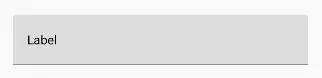
TextField sencillo con una sola línea
var text by rememberSaveable { mutableStateOf("") }
TextField(    value = text,    onValueChange = { text = it },    label = { Text("Label") },    singleLine = true)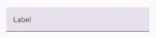
var text by rememberSaveable { mutableStateOf("") }
TextField(    value = text,    onValueChange = { text = it },    label = { Text("Label") },    singleLine = true)
TextField con placeholder
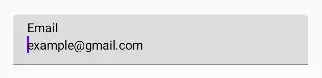
var text by rememberSaveable { mutableStateOf("") }
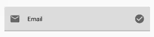
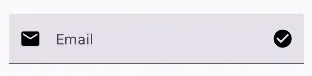
TextField( value = text, onValueChange = { text = it }, label = { Text("Email") }, placeholder = { Text("example@gmail.com") })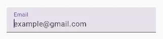
var text by rememberSaveable { mutableStateOf("") }
TextField(    value = text,    onValueChange = { text = it },    label = { Text("Email") },    placeholder = { Text("example@gmail.com") })
TextField con leadingIcon y trailingIcon
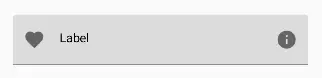
var text by rememberSaveable { mutableStateOf("") }
TextField(    value = text,    onValueChange = { text = it },    label = { Text("Label") },    leadingIcon = { Icon(Icons.Filled.Favorite, contentDescription = "Localized description") },    trailingIcon = { Icon(Icons.Filled.Info, contentDescription = "Localized description") })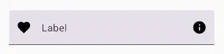
TextField con un mensaje adicional debajo
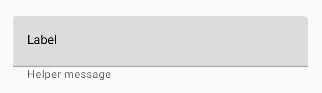
var text by rememberSaveable { mutableStateOf("") }
Column {    TextField(        value = text,        onValueChange = { text = it },        label = { Text("Label") }    )    Text(        text = "Helper message",        color = MaterialTheme.colors.onSurface.copy(alpha = ContentAlpha.medium),        style = MaterialTheme.typography.caption,        modifier = Modifier.padding(start = 16.dp)    )}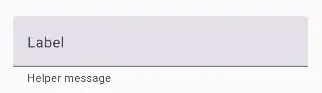
val errorMessage = "Text input too long"var text by rememberSaveable { mutableStateOf("") }var isError by rememberSaveable { mutableStateOf(false) }val charLimit = 10
fun validate(text: String) {    isError = text.length > charLimit}
TextField(    value = text,    onValueChange = {        text = it        validate(text)    },    singleLine = true,    label = { Text(if (isError) "Username*" else "Username") },    supportingText = {        Row {            Text(if (isError) errorMessage else "", Modifier.clearAndSetSemantics {})            Spacer(Modifier.weight(1f))            Text("Limit: ${text.length}/$charLimit")        }    },    isError = isError,    keyboardActions = KeyboardActions { validate(text) },    modifier =        Modifier.semantics {            // Provide localized description of the error            if (isError) error(errorMessage)        })
TextField para gestionar contraseña
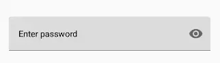
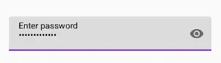
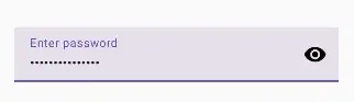
var password by rememberSaveable { mutableStateOf("") }var passwordHidden by rememberSaveable { mutableStateOf(true) }
TextField(    value = password,    onValueChange = { password = it },    singleLine = true,    label = { Text("Enter password") },    visualTransformation =        if (passwordHidden) PasswordVisualTransformation() else VisualTransformation.None,    keyboardOptions = KeyboardOptions(keyboardType = KeyboardType.Password),    trailingIcon = {        IconButton(onClick = { passwordHidden = !passwordHidden }) {            val visibilityIcon =                if (passwordHidden) Icons.Filled.Visibility else Icons.Filled.VisibilityOff            // Please provide localized description for accessibility services            val description = if (passwordHidden) "Show password" else "Hide password"            Icon(imageVector = visibilityIcon, contentDescription = description)        }    })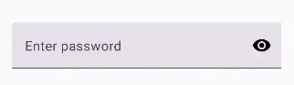